Mistaking a first impression for an intention
A dark room might feel solemn. A scattered arrangement of objects might look like a scene of disruption. These responses are useful starting points, but they do not prove that the artist intended solemnity or disorder. Lighting, scale, sound, your mood and the works you saw just before entering can all shape an immediate reaction.
The mistake is not having a strong response; it is turning that response into a claim about the artist without checking what supports it. Try separating three statements: “I notice that the room is dim,” “the dimness makes me feel cautious,” and “the artist wanted viewers to feel cautious.” The first describes an observable feature, the second reports an experience, and the third proposes an intention. Moving from one to the next requires more evidence.
Look for patterns across the exhibition. Does the lighting change around different works? Is it part of the artwork or a feature of the venue? Could it protect a light-sensitive material? Questions like these may not yield a single answer, but they make an interpretation more precise.
Treating every exhibition choice as the artist’s choice
An exhibition is often shaped by more than one person. Artists may make decisions about objects, images, sound and placement, while curators and exhibition teams may contribute to selection, sequencing, labels, lighting and access. In some cases the artist determines nearly every detail; in others, the presentation reflects considerable collaboration. The room itself also imposes limits.
This matters when a wall text places two works in conversation or a narrow doorway makes one piece feel like a surprise. Those effects may be meaningful, but they are not automatically evidence of the artist’s original plan. Before attributing a choice, ask what the exhibition tells you about who organized it and whether a work was made for that space. If that information is unavailable, describe the effect of the display rather than assigning it to one person.
A careful account can still be vivid: “Placing these pieces opposite each other encourages comparison” says what the arrangement does. It avoids the less secure claim that the artist intended viewers to compare them. That distinction leaves room to discuss the exhibition as an experience in its own right.
Reading materials and symbols as a fixed code
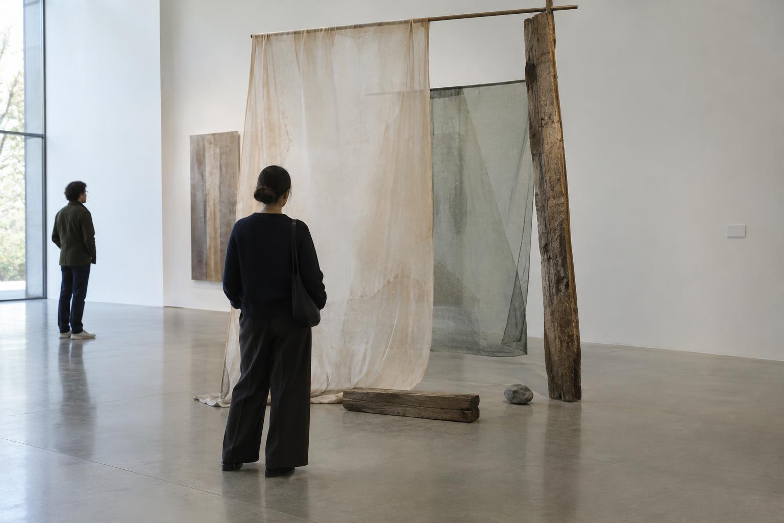
Materials carry associations, but they do not have universal meanings. Rusted metal may suggest decay to one viewer and repair or endurance to another. A repeated shape may be symbolic, structural or simply useful to the process of making the work. Deciding that a material “stands for” one idea can flatten the decisions visible in its texture, weight, joins and placement.
The same caution applies to biographical information. A detail about an artist’s life may illuminate a work, yet it does not turn every color or object into a private message. Nor should a broad label for an artist’s background substitute for looking closely at the work. When an interpretation depends on biography or symbolism, ask which visible features support it and which features it leaves unexplained.
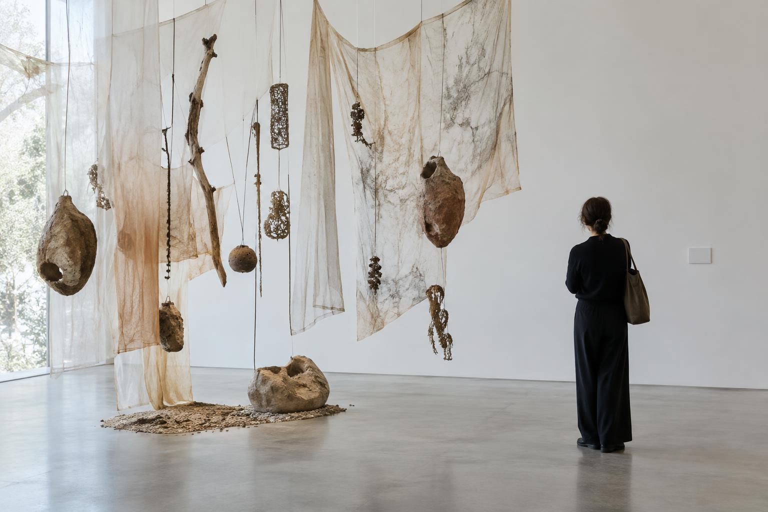
Instead of looking for a one-to-one translation, consider what a material does. Does a reflective surface bring viewers into the image? Does a fragile structure change how closely people approach? Does repetition create a rhythm that becomes apparent only while walking? These questions connect possible meanings to an encounter you can describe.
Using labels as answers instead of aids
Wall labels and exhibition texts offer valuable context, but they are short forms of writing with their own focus. A label might describe a process, propose a theme or introduce a curatorial reading. It cannot contain every decision that went into a work, and its wording need not settle what the work means to every viewer. Likewise, an artist’s statement can clarify an aim without predicting every effect the finished work will have.
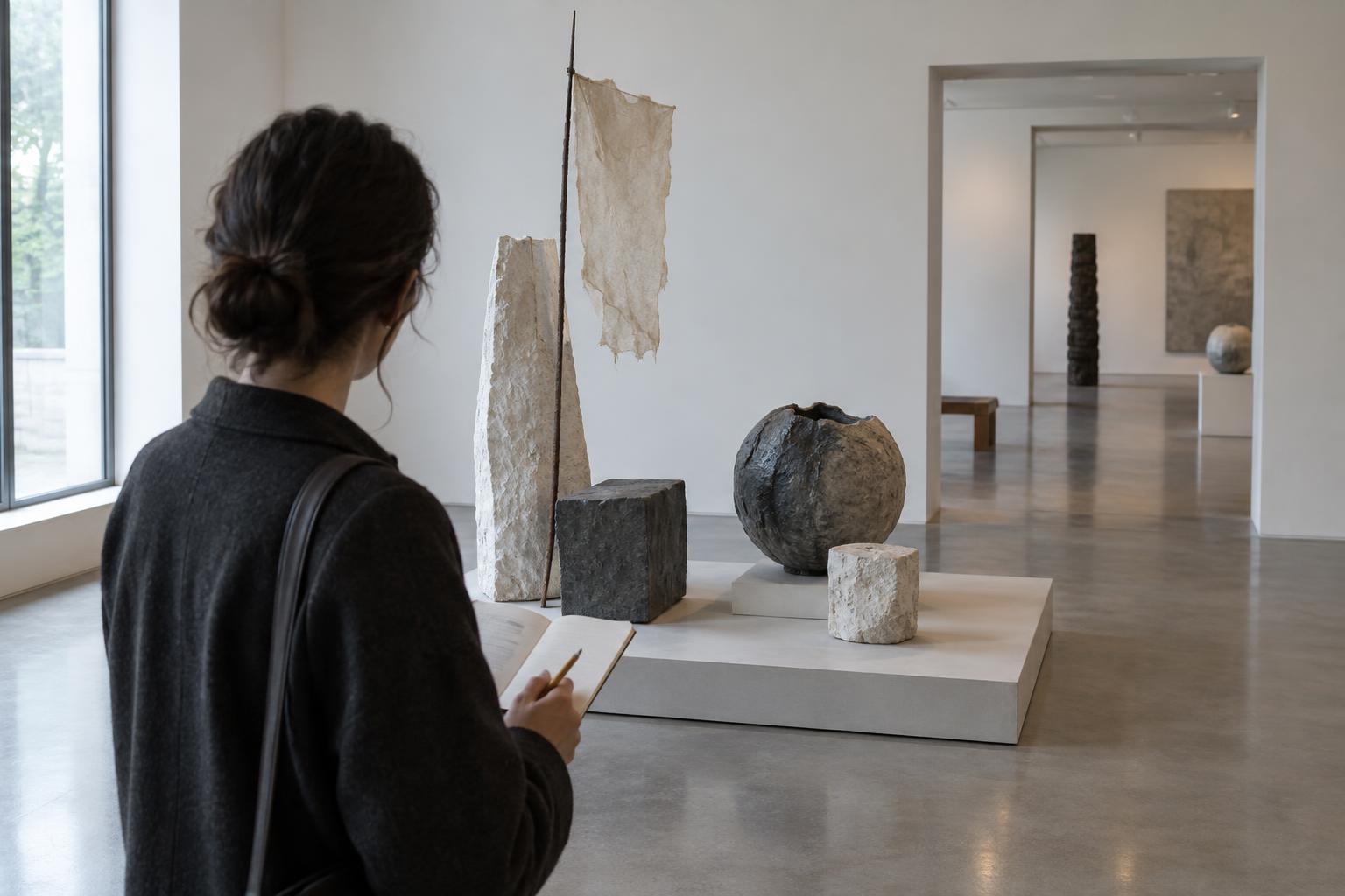
One useful approach is to look before reading, then return to the work after reading. Note what you noticed independently and what the text helped you see. If the two differ, treat the difference as a question rather than a test you have failed. A label might direct attention to construction while you were drawn to the way visitors move around the piece; both observations can help you understand the encounter.
The strongest interpretation need not claim certainty about a private intention. It can say what is present, explain how specific choices seem to work together, and identify where evidence runs out. Phrases such as “this arrangement suggests” or “one possible reading is” are not evasions when they reflect genuine limits. They make space for informed disagreement while keeping the artwork, rather than a guess about the artist’s mind, at the center of the discussion.