Start with the work, not the label
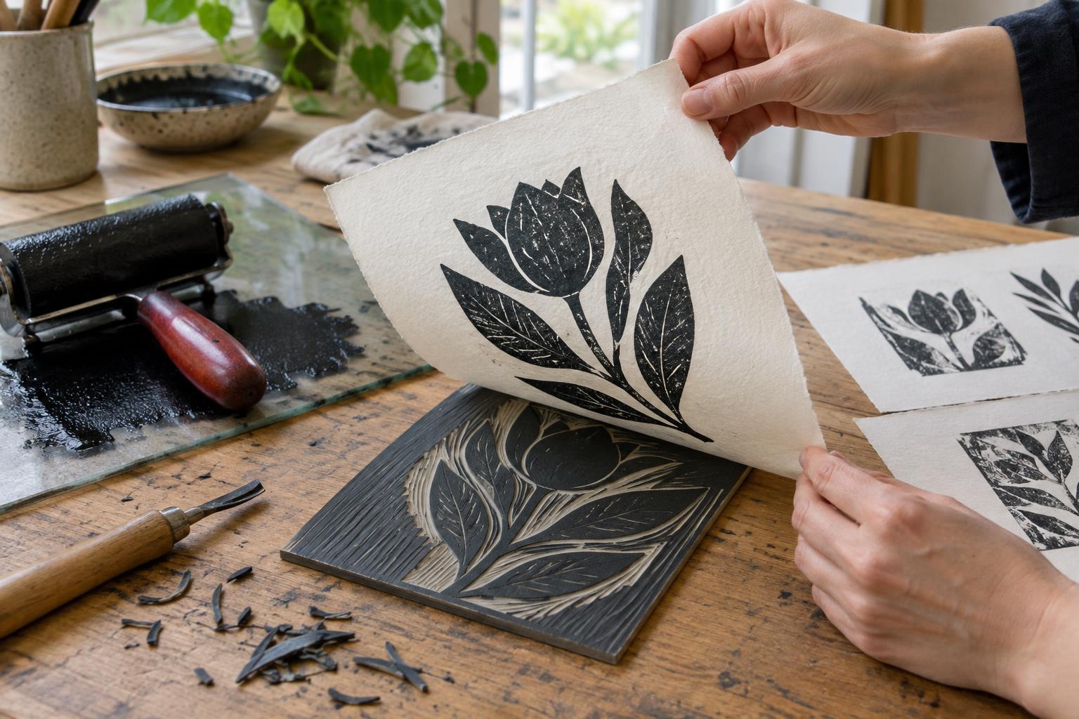
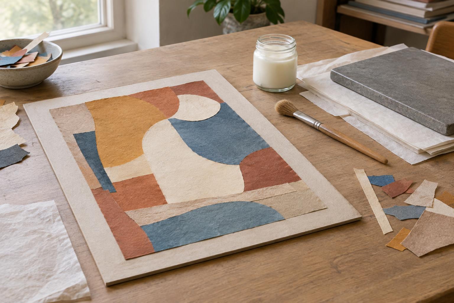
Choosing paper becomes easier when you begin with what you want to do to it. A sheet for quick pencil studies has a different job from one that must hold repeated wet washes, crisp folds or a large printed image. Think about the tools you will use, how much pressure or water you will apply, and whether the finished work will hang flat, stand freely or be handled.
Three qualities offer a useful starting point: weight, texture and grain. Weight describes the mass of paper for a given area; texture describes its surface; grain describes the predominant direction in which many of its fibers lie. These qualities interact, but none tells the whole story. Two papers with the same stated weight can feel and perform differently because of their fiber content, sizing, manufacturing and surface treatment.
What paper weight can and cannot tell you
Paper weight is often given in grams per square meter, or gsm. In general, a heavier sheet feels more substantial and may better resist rough handling. But weight is not a direct measure of thickness, stiffness or suitability for water-based media. A dense, smooth sheet can be thinner than a bulkier sheet with the same gsm, while a heavy paper can still buckle if it absorbs enough moisture.
For dry drawing, lighter paper may be entirely adequate, particularly when sheets will stay in a sketchbook. If you erase repeatedly, scrape, print in layers or use wet media, test whether the surface holds up before committing to a finished piece. With water, observe both the front and back of a sample: does the sheet cockle, pill or allow color to show through? If flatness matters, your mounting or stretching method may be as important as the number on the package.
Texture changes the mark
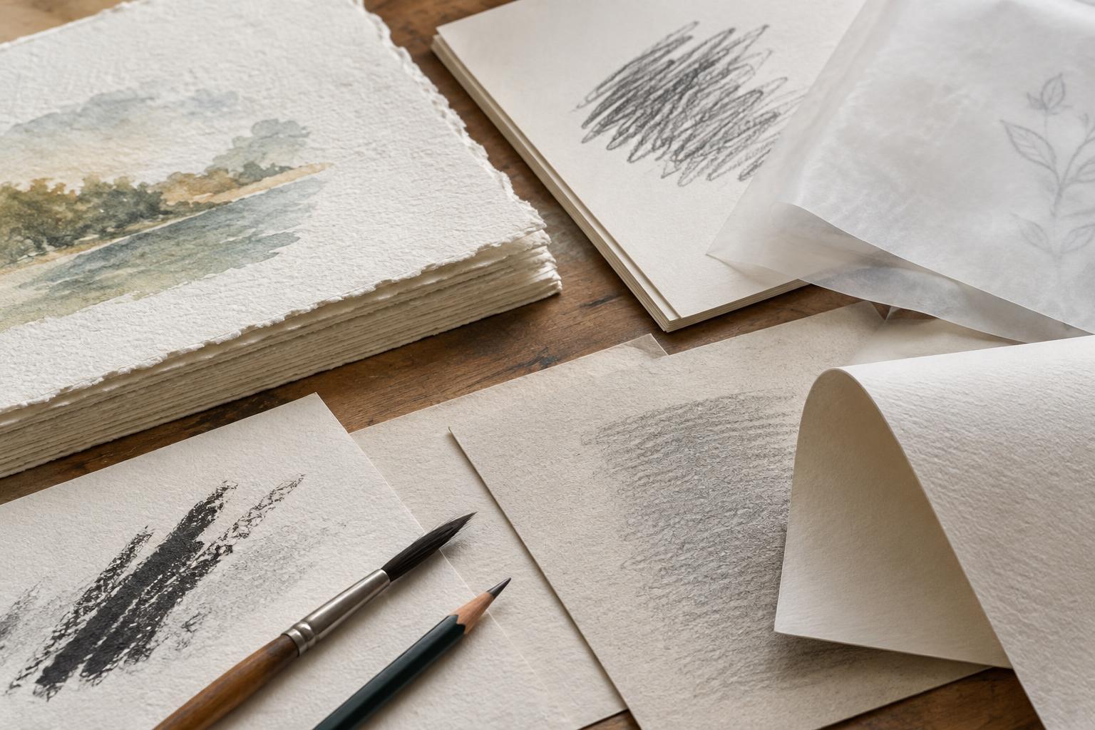
Texture is sometimes called tooth. A textured surface catches dry material on its high points, leaving small gaps that can give charcoal, graphite or pastel a broken, lively appearance. A smoother surface lets a pen travel with less interruption and can make fine lines easier to control. Neither is automatically better: a highly textured sheet may frustrate tiny details, while a very smooth one may offer less grip for repeated layers of dry pigment.
Surface character also affects liquid media. Ink may form a sharp edge on one paper and spread slightly on another; a wash may settle into low areas of a textured sheet. Sizing, a treatment that influences absorbency, plays a part alongside visible texture. Rather than judging by touch alone, make a small chart of the marks your practice depends on: a slow line, a fast line, an erased patch and, if relevant, a wash laid over a dry layer. Note how the surface looks after it dries.
Grain matters when paper bends
Grain direction is particularly useful to understand when you fold, bind or build with paper. A sheet often bends more readily parallel to its grain and resists a little more across it. A fold made against the grain may be more prone to cracking or springing open, especially with heavier or coated stock. For a book, it is usually helpful to align the grain parallel to the spine so pages turn and lie more comfortably.
You can compare directions on an offcut by gently curving it one way and then the other without making a crease. The direction that offers less resistance is generally parallel to the grain. Another check is to fold two small samples at right angles and compare the creases. These are practical clues rather than guarantees: some handmade or specialty papers have less predictable grain, and coatings can affect how a fold behaves. Test the actual sheet before cutting a large batch.
Build a small, useful paper library
Save offcuts from papers you use and label each with its name, weight if known, and the medium you tested. Keep the test marks with the sample, including an area that has been erased or reworked. When possible, make two samples: one left loose and one mounted, folded or displayed as the final piece will be. A paper that looks excellent on a table may behave differently when suspended, lit from behind or viewed at an angle.
For work intended to last, ask about the paper’s composition and any permanence information supplied by its maker, while recognizing that storage and display conditions also matter. For temporary installation or experimentation, a less durable sheet may be a deliberate choice. The aim is not to find one perfect paper. It is to notice which physical qualities support your marks, your construction method and the experience you want a viewer to have.