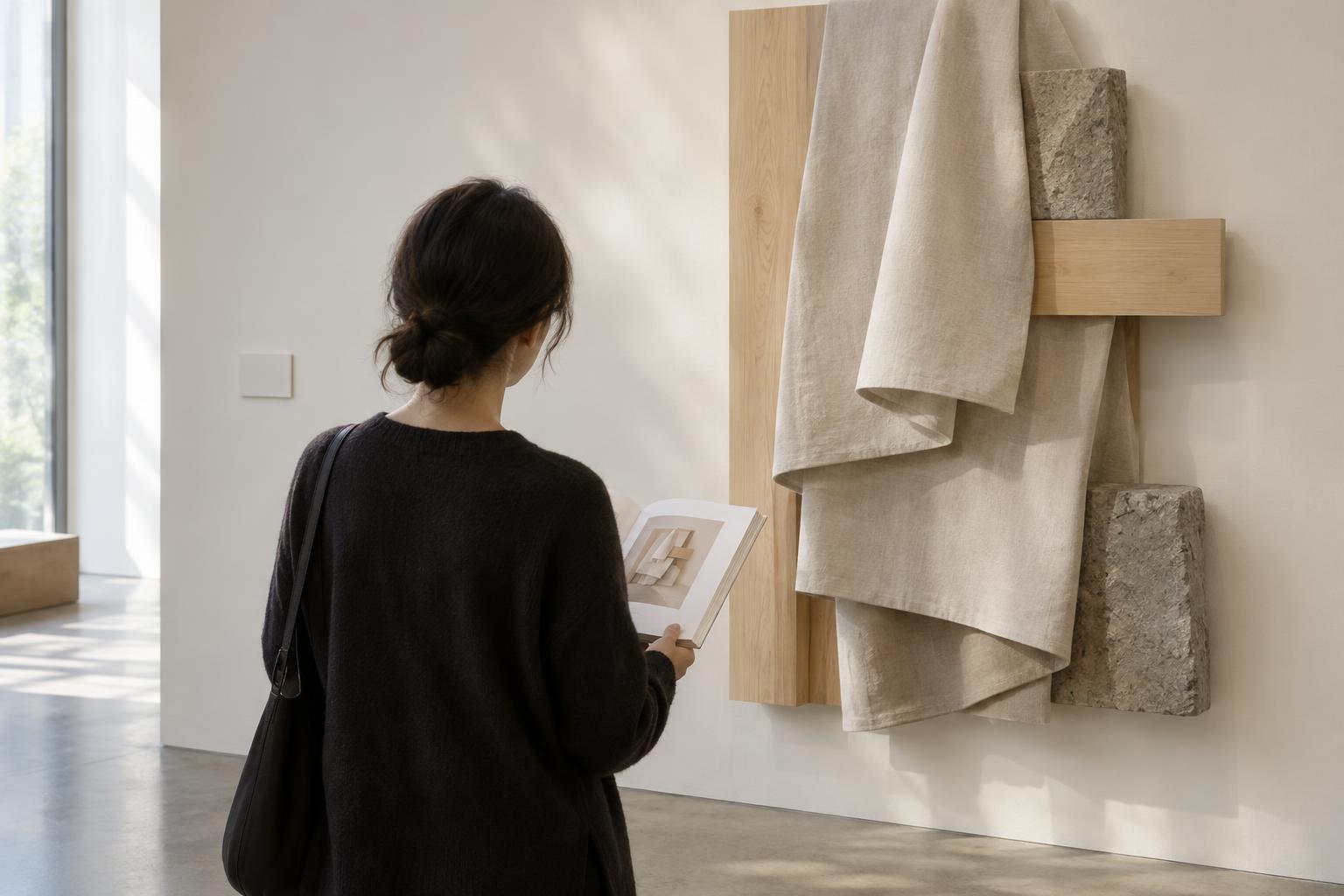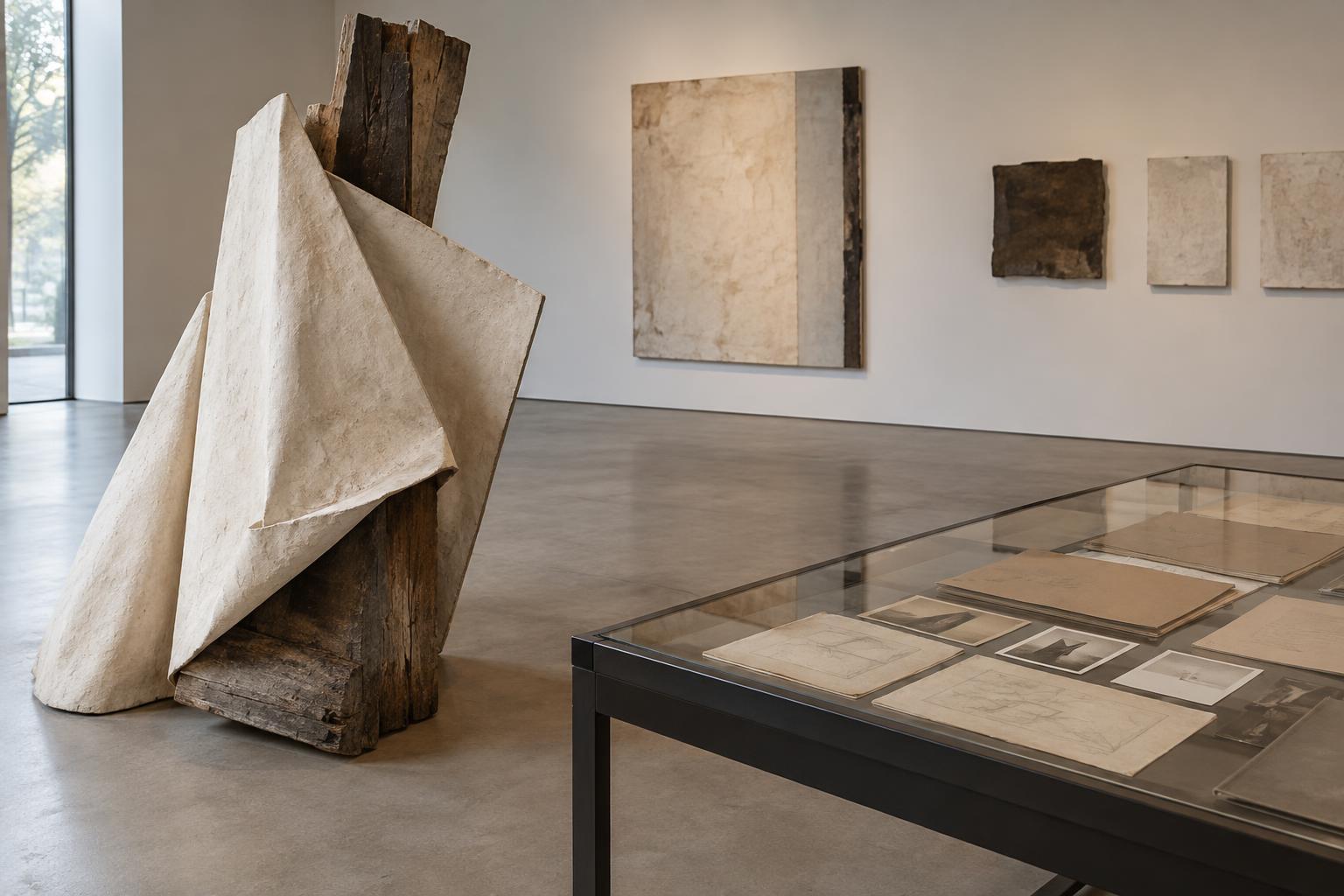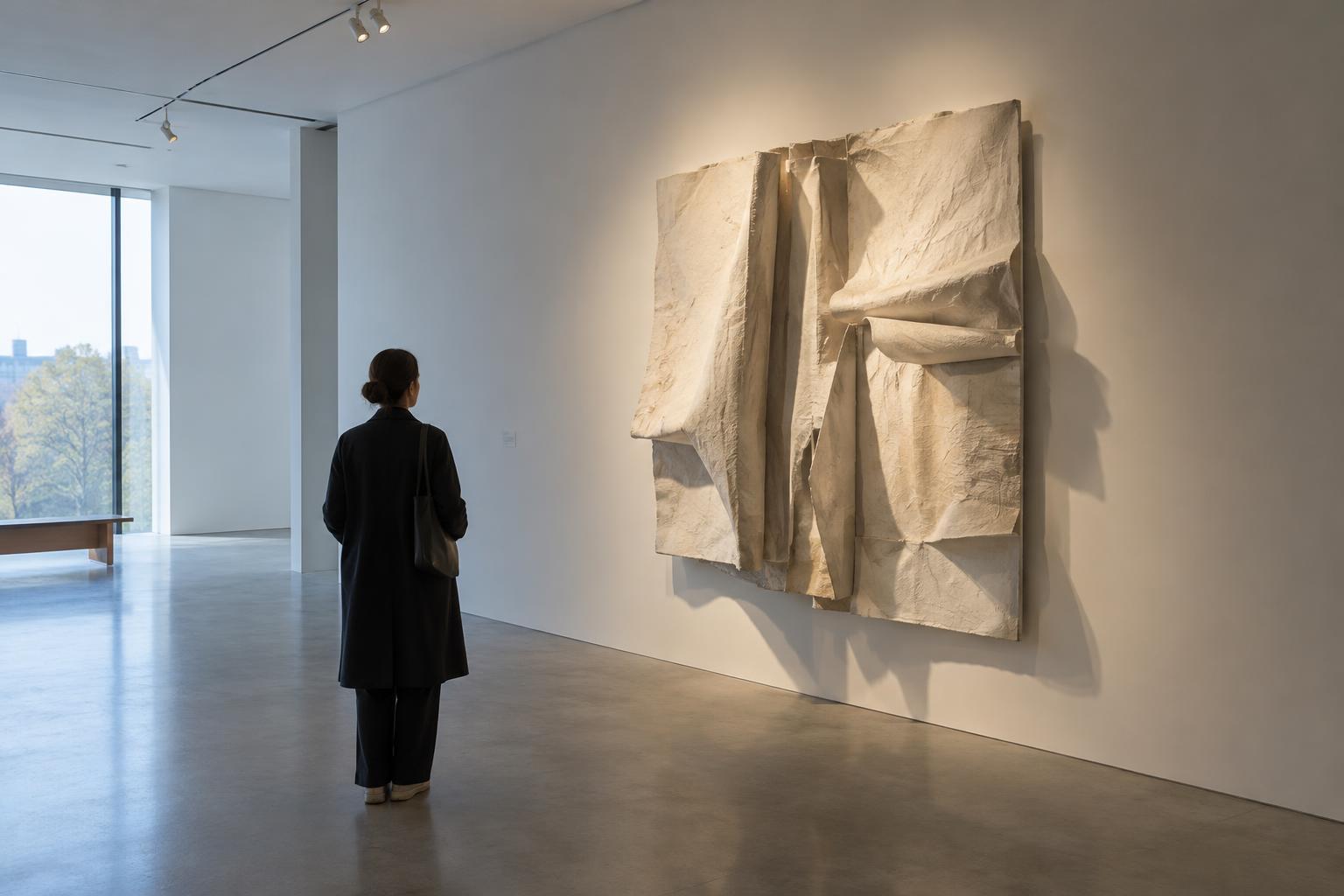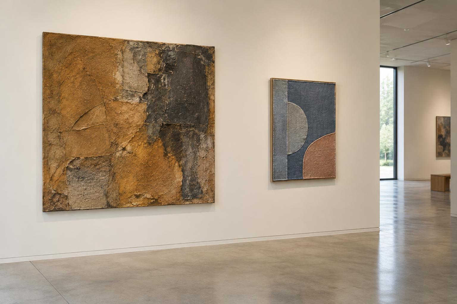
A pairing begins with attention
In an exhibition, the placement of two artworks side by side does something simple but powerful: it makes each work part of the other’s immediate surroundings. A visitor may notice a shared color, a similar shape or a striking difference in subject before reading either label. The pairing gives the eye a reason to move back and forth, testing an observation against what is nearby.
That invitation is not the same as an instruction to find a single hidden message. Works may be neighbors because of a thematic connection, a useful contrast or the practical demands of the room. Still, placement affects the encounter. Instead of asking, “What does this pairing mean?” as though it has one answer, it can be more productive to ask, “What becomes easier to see in each work because the other is here?”
Similarity and contrast offer different routes
Two works made with comparable materials can bring subtle differences into focus. If both use fabric, for instance, one might hang loosely while the other is pulled taut. Seen together, those choices become more apparent than they might be in separate rooms. A shared motif can work in much the same way: repetition encourages visitors to look past the first resemblance and notice changes in scale, texture or approach.
Contrast can be equally revealing. A small, quiet drawing beside a large, visually dense work may make the drawing’s restraint feel deliberate, while the larger work may seem more insistent. These impressions are possibilities, not facts built into the objects. Try describing what you can observe before deciding what the difference signifies. “One surface is smooth and the other is rough” gives you firmer ground than immediately declaring that one work represents calm and the other conflict.
Space is part of the conversation
Side by side does not always mean equally close or equally prominent. The gap between works, their relative heights and the direction from which visitors approach them all influence the comparison. A generous space may let each work hold its own ground; a narrow gap may encourage the eye to treat them as a pair. If one is visible from a doorway while the other appears only after you enter, they may reach you in a sequence rather than at the same moment.
It also matters whether you can view both comfortably from one position. A neighboring sculpture might ask you to walk around it, while a wall-based work holds a more fixed orientation. In that case, the relationship changes as you move. Taking a few steps back, then approaching each work separately, can reveal whether your first impression came from the artworks themselves or from a particular sightline.
Context can sharpen or complicate a reading
Labels, section titles and other nearby works can suggest why a pairing was chosen. A label may identify distinct materials that look similar at first glance, or explain that two works address related questions through different methods. Such information can enrich looking, but it need not replace it. Notice what you saw before reading, then consider which impressions the text supports, challenges or leaves open.
Avoid assuming that neighboring works share an artist, a date or a point of view. Even when a display encourages comparison, it does not necessarily claim agreement between them. One work might appear to answer another, or it might resist the terms of comparison altogether. Interpretation becomes more careful when you distinguish what the arrangement suggests from what the artworks and accompanying information actually establish.
A simple way to look at a pair
Begin by giving each work a moment on its own. Identify one feature that holds your attention in each: a material, a gesture, an image or the way it occupies space. Then stand where you can see both and ask what changes. Does a color become more noticeable? Does a repeated form begin to feel different? Does one work alter your sense of the other’s scale or pace?
Finally, consider what would happen if the works were separated. This question helps identify what the placement contributes without treating every similarity as intentional. You do not need to settle on a definitive explanation. A worthwhile reading can be modest: these two works make a particular contrast visible, and the room gives you the chance to spend time with it.