Transparency is a relationship, not a property
A transparent sheet can appear almost absent in one setting and highly visible in another. Its effect depends on what lies behind it, how light reaches it and where a viewer stands. Glass, acrylic, acetate and clear film may all let a viewer see through them, yet their surfaces, thicknesses and edges behave differently. Rather than treating transparency as a neutral support, artists can use it to make viewing itself part of the work.
Begin with a simple question: what should a viewer notice first—the image on the surface, the space behind it or the act of looking through it? A drawn line on clear film might seem to float against a distant wall. The same line placed close to that wall may read as part of it. Moving a sheet only a short distance can change whether two elements merge or remain distinct. Small placement tests are often more revealing than choosing a material by appearance alone.
Build layers that change as the viewer moves
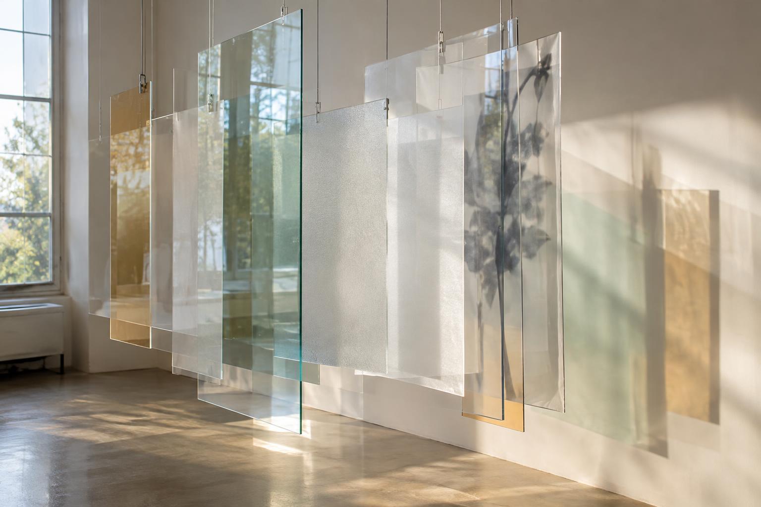
Layering gives transparent materials a way to hold several images in the same field of view. Marks on separate sheets can overlap from one position and pull apart from another. Try placing a simple shape on each of two or three sheets, then vary the distance between them. Observe the arrangement from the front and from either side. This makes it easier to decide whether the work needs a stable composition or one that shifts with movement.
Spacing also controls how much the background participates. Sheets mounted close together may read as a single dense image, while wider gaps allow shadows, wall texture and passing viewers to enter the composition. If the work will hang in a room, test it there when possible. A tabletop arrangement may not predict what happens when a viewer can walk around it or when a window becomes part of the view.
Use opacity to direct attention
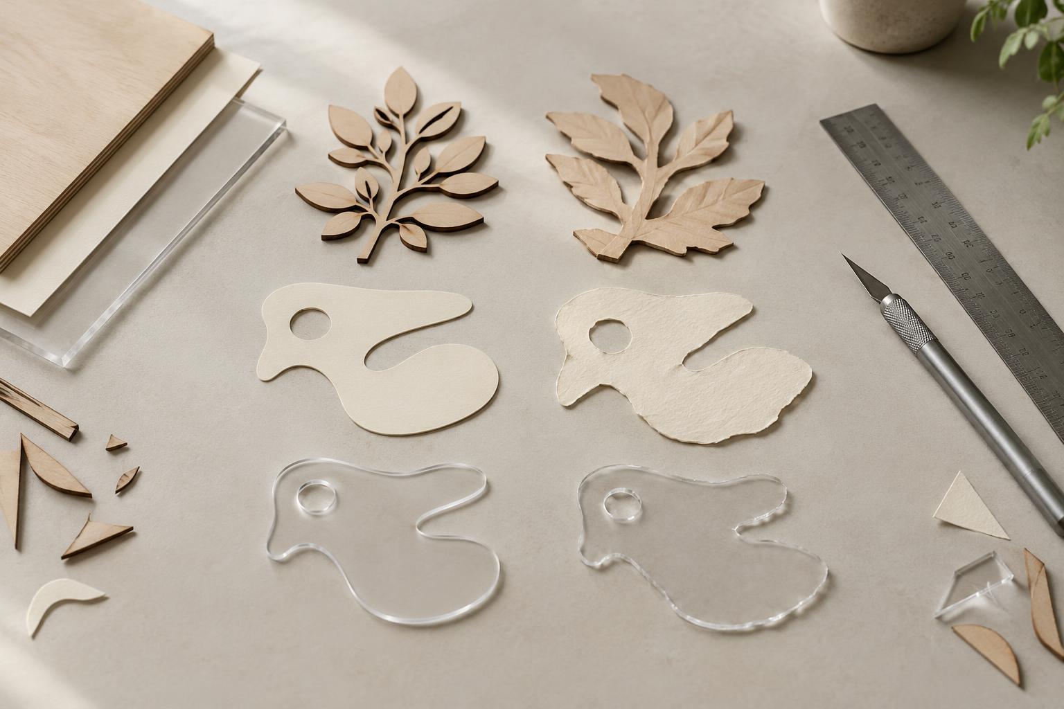
Transparency and opacity need not be opposites in a single work. Frosted surfaces, translucent paper, thin paint and partially covered film can create degrees of visibility. An opaque area may conceal a support or provide a pause within a complex arrangement. A translucent area may preserve the presence of something behind it without allowing that thing to become fully legible.
Test opacity with small samples before committing to a large surface. Place each sample over dark and light backgrounds, then look at it in both direct and diffuse light. A mark that seems delicate against white may dominate against black. Consider leaving some areas clear: open passages can give the eye a route through crowded layers. The goal is not always maximum depth. Selective concealment can make a viewer aware of what cannot be seen.
Work with reflections rather than against them
A reflective surface can bring lamps, windows and viewers into an artwork. That may support the idea of a changing, shared image, or it may obscure a detail the artist wants people to see. Check the work from several likely viewing positions and at the lighting levels available in its intended space. Tilting a panel, changing its height or shifting a light source can alter the balance between reflection and the image beneath it.
Edges and mounting methods matter too. A polished edge may catch light and emphasize the object as a sheet, while a concealed edge can make an image feel less anchored. Visible clips and spacers can clarify how layers are held apart; hidden supports may encourage a sense of suspension. Neither approach is inherently better. Choose the one that helps viewers understand—or question—the relationship between image, surface and space.
Make testing part of the finished work
Transparent materials reward observation at full scale. Keep a record of promising combinations: material, spacing, background and lighting. A quick photograph can help compare arrangements, but return to the physical test before deciding. A camera fixes one viewpoint, while a viewer encounters changing reflections and overlaps as they move.
Practical handling can shape the result as well. Fingerprints and scratches may distract from a precise composition, though visible wear could suit a work concerned with touch or use. When cutting, hanging or cleaning a material, follow its product guidance and choose supports appropriate to its weight and fragility. Allow enough time to revise the installation after seeing it in place. With transparent work, the room is rarely just a backdrop; it is one of the materials.